I have been using digital cameras for a very long time. The Nikon D1 many years ago became my first descent DSLR camera body. I've also used all the usual suspects in terms of imaging software, like Photoshop that I have been using since its legendary version 2.5, up until when Lightroom came by. Go figure...
During this time I had to continuously swallow a huge frustration. The guilty party was obviously Colour Management (CM). I generally thought I understood the implications of a lacking CM in digitally created and printed images, like, experiencing one color vista on a monitor and getting a different one coming out of the printer. However, I had neither the tools nor the understanding of CM, especially how to 'calibrate' the hardware in my workflow and how to balance my colors throughout. We've all been there, haven't we?
So much I knew. But how do you practically do CM? What do you need to do when you graciously witness a scene worth capturing, shoot it with your camera, bring it to your computer for postprocessing, and finally print your 'masterpiece'?
I'm not planning to explain exhaustively the CM theory here, as I am merely a gifted amateur and not a Subject Matter Expert, by any means! I only wanted to share my recent experience, and create a sort of a personal notebook to return to in case I forgot something about 'how I done it' down the road. Besides, the internet is packed with reference and teaching material. I personally learned what I know from two excellent teachers, Joe Brady and Ben Long, who offer online classes in Youtube and Lynda.com. I'd only like to pen down my thoughts about it and possibly demystify some of the concepts that bothered me personally for over a decade and made me lose hundreds of work-hours in frustration by experimenting and never being able to consistently assure the quality of my outputs. If you are interested to read on, feel free to do so.
Colour Space
The Science of colours is quite a complex discipline, packed with theories full of mathematical formulas and of research experiments, involving various disciplines (mathematics, physics, psychology, physiology...), aiming to explore and formally define what is 'color', and how we experience it as humans in the world that surrounds us. And, being a science, it takes quite a long time to grasp its fundamentals, study it in depth, practice it, really learn it and consider yourself a colours expert. To the rest of us, who only seek consistency and truthfulness of colours throughout our imaging workflows, merely for the love of the Photograph, thankfully none of this expertise is necessary. It's simply a 'nice to have' thing, not a 'must have'...
Well here's the thing. That's how I understand it. It all starts with the Color Space. This is a term used to describe the universe of all colors defined within a 'scope'. If the scope is "all the colours visible by humans", the corresponding colour space will contain colours from all electromagnetic wave frequencies of the visible spectrum, from the limit between infrared and red to the limit between violets and ultraviolet. This particular color space was first scientifically formalised in the 1930s. Since the recent advent of digital home computers and peripheral devices (in color), new colour spaces have also emerged to help establish colour communication among the digital devices involved. HP together with Microsoft assembled a large number of participant and relevant manufacturers (including Pantone) back in 1996 and established 'sRGB' as the new standard of color space that most digital devices would henceforth comply with.
Is sRGB the only standard in the digital world? Unfortunately, not so. There are quite a few more, like, AdobeRGB (this one also contains many more colours than sRGB!), ProPhotoRGB, and CMYK (for printers). To this day, sRGB is the dominant standard however, and it is the one that is supposed to be supported by all computer colour monitors anywhere. In other words, if an image file was created within the sRGB space by a compliant device, computer, scanner, camera, then all its colours should be faithfully visible on the screen of a monitor that supports sRGB as well (most of them do, as mentioned) and there would be no clipping of colours during display. The color space specification is usually embedded in the file's metadata (header). Whether the displayed monitor colours are visually 'identical' to the corresponding standard sRGB colours, however, is an entirely different issue. It all depends on the quality of the monitor itself and its current state of 'calibration' vis-à-vis the standard sRGB colour set! But, more on that later.
Internals of a workflow.
Let's follow a workflow from beginning to end to understand what happens. Suppose you take a picture with your digital camera of a scene of your liking. Modern camera internal processing software will commonly process the captured image within one of two spaces, sRGB or Adobe RGB. The better camera manufacturers require you to define which of the two you want, others won't bother. They'll simply use sRGB instead.
After transferring your image files to your computer next, your imaging software application (Photoshop, iPhoto, Lightroom, Aperture or any like this) will read the colour for each image pixel in the files and will ask the OS to map them to the same sRGB values (colours) on your monitor. If all devices and software apps up to this point spoke properly the sRGB language then your image on the monitor should very accurately reflect all the colours on your original scene and remind you exactly what triggered your urge to shoot that picture in the first place. Unfortunately, in the early days, this used to be a moment of sheer disappointment because of mismatches of colours and quality of the hardware, but thankfully free markets competition and shareholder pressures forced manufacturers to aggressively innovate and improve their gear and software to the point that quality has dramatically improved.
But, there's more. Imagine your shot came out so stunning that you decide to print it on paper. Your imaging software displays the print configuration panels, where you simply select the paper quality of your liking -remember, different papers print pictures in quite different looks-. For ease of use, you explicitly configure the printing job to be 'managed by the printer' and subsequently click 'Print'. Computer sends the file to the printer next, declaring it as an sRGB object. Since you configured the print to be managed by the printer itself, the computer can only send the image files based on the bare sRGB specification. This is in order to avoid 'misunderstandings'. It does the same when you send your files to a Printing Lab to create enlarged versions of your marvels that you can't possibly print in your 50 bucks inkjet printer. In turn, the printer's software interprets the received sRGB data accordingly and prints on paper to the best of its capability a near-stunning representation of your beloved scene, for future generations to admire! And pigs will fly... If things were only that simple...
There were 3 devices that were involved in this workflow, the camera, the computer (and its monitor) and the printer. For a scanner workflow, replace the camera with a scanner and the same repeats. In reality, what typically happens is that none of the devices mentioned does a perfect job respecting the sRGB specification. It's not that they change the sRGB model mechanics, but when sRGB tells them to use a particular color, their practical interpretation of that color is slightly to severely different than the standard color that was proposed. So, devices need corrections. In fact, there exist well defined dedicated procedures and hardware tools that examine how much deviate a device's colours from the standard, and they then issue the necessary corrections. Such are known as 'profiles'! Hence, profiling is an automated process that occurs during the various stages of the workflow and corrects a device's interpretation of the standard colours.
In other words, Colour Management is in fact the set of activities applied to a given workflow in order to measure device deviations from sRGB's Standard Colours, issue corrections (a.k.a. ICC profiles) and further assure colour consistency from the original captured scene throughout the workflow to the final print. The process of testing and adjusting each individual device is called 'calibration'. So, when you hear someone say, my monitor needs calibration, he/she really means the monitor needs a profile to correct its current interpretation of sRGB standard colours and make them look more like what they were supposed to.
The Gamut
The gamut is a continuous subset of a color space that is supposedly supported by a given digital device. Usually, it is represented as a 2D or 3D plot in a system of fundamental colour coordinates. The gamut plot literally delineates within a colour space all the colours that the device can support. As an example, the animated Gif in the beginning of this blogpost shows a 3D representation of two gamuts; the transparent wireframe is the standard sRGB container, whereas the coloured 3D solid, contained for the largest part inside the sRGB plot, is the gamut of my Canon Pro9000 inkjet printer calibrated for Epson's Colorlife pearl touch paper and the Cli-8 Canon ink cartridges.
There are some interesting observations to make here. Since the two gamuts are not identical, this means that I might capture colours with my camera, and subsequently display them on my monitor that my particular combination of printer/inks/paper would never be able to reproduce on a print. Regardless how you might combine ink dots coming out of the printer head's nozzles in the four basic colours Yellow, Magenta, Cyan and Black (Key), a.k.a. the YMCK colour space (in which all printers operate), there is no way you can reproduce colours of the sRGB specification that are outside the printer's gamut. Even worse. As you can observe in the Gif plot above, there are colours in the blue green part of the printer gamut that fall outside sRGB altogether! Otherwise said, the printer could possibly print beautiful blue and green colours that the sRGB monitor is not capable of displaying. How can you print such colours then, if you happen to be a sucker for bluegreens? One way is to process your images into another space, like AdobeRGB, which is larger than your monitor's sRGB, and hope these colours will eventually show up in your print. You won't be able to tell, however, until the print comes out, because you can't possibly softproof the images beforehand; your monitor is indeed incapable of displaying them, remember? Or, you can forget about printing deep bluegreens for ever. Sounds pretty awful, doesn't it?
Next, what happens if your image contains colours that you can witness on the monitor but your printer can't print, then? These colours are called 'out-of-gamut' and have to be dealt with somehow, otherwise images would print with visible white holes in them. Like certain Van Gogh or Lautrec masterpieces, where the absence of paint in large parts of their canvas left the bare unpainted base serve as an integral part of their work. As the Masters that they were of course, they used it to their advantage. I suppose they didn't do it because they were left out of paint, although one might never find out...
In the digital printing practice, out-of-gamut colours are replaced with similar colours that are 'in-gamut'. There are four/five methods to do that and the process is called 'rendering intention'. However, there are only two of those methods that are of value to ourselves, end-users, and these are the 'perceptual' and 'relative colorimetric'. Worth mentioning, the former not only replaces out-of-gamut colours with similar inside the gamut, but also moves other neighbouring in-gamut colours to new gamut positions to create a more pleasing human feeling, which at the same time might cause tonal shifts overall. It is therefore up to the user to decide which of the two methods wants applied, depending on the general look that the impacted image acquires after the rendering intent was applied. One could actually inspect the rendered images before printing by 'softproofing', a function we find in some good imaging software like Adobe Lightroom. Softproofing presents to the user the effect of either method, as well as the pixels that caused the trouble in the first place. It actually shows all out-of-gamut pixels using a conspicuous colouring. The phenomenon of out-of-gamut colours in an image is known as clipping. I generally prefer the perceptual method. It seems to preserve the depth of colours. The few times I used relative the images came out with less contrast, a bit on the side of 'flat'.
What I forgot to mention is that the 3D solid plot of a colour space in the animated Gif above is shown in the Lab coordinate system, where L denotes the 'lightness' (L) or 'brightness' of a given colour point, and a,b are plot coordinates used to describe the remaining of a colour's properties, like saturation and hue. The app I used to create that Gif is Apple's Colorsync utility. There also exist apps that offer more than Colorsync. One I have seen is ColorThink Pro by Chromix. This one can even display the 3D gamut plot of any given image (!) in the form of a set of coloured 3D plot points in space, whereby you can visually inspect if your particular image falls within your target printer/gamut or it contains out-of-gamut areas. It's like softproofing, but in ColorThink you get a 3D plot representation of the image as a cloud of dots superposed upon the printer Gamut solid. However, this is far less attractive than softproofing as the latter also presents the clipping effect on the image itself, and visibly simulates the overall impact of the rendering intention as well...
Practically, the theory above explains why we often see prints that don't quite match what we see in our monitor, even if both our printer and monitor were perfectly calibrated. Colour management cannot guarantee you perfect prints, only the best possible within the perimeter of the capabilities of your printer/ink/paper combination. So, if you don't usually like your prints, and prefer the monitor display instead, start with printing on a different paper. And if that is still not enough, try buying another printer. If you are out shopping for printers, it would be nice to know how much of the standard sRGB space is practically 'covered' by the gamut of the printer you are interested in, and that for papers with quality and surface feels of your liking. I don't believe, if you posed a printer salesman a query like this, she'd rush to answer it without hesitation. Most probably, she might think you are pulling her leg or have fallen on Earth from an alien planet... true story!
Profiling your devices (and doing proper CM)
Here's the moment of truth. I'll tell you what I did with my gear, since there are several commercial solutions for doing this, varying from affordable inexpensive to non-affordable very dear. From a few hundred to several thousand bucks, that is. Having the calibration done by specialized services is rarely a practical solution to us, amateur users, I think. It's pretty easy to calibrate a camera, but bringing your computer and printers to a specialized service is too much of a hustle. At least, for me it is.
I have acquired Datacolor's SpyderSTUDIO for less than half a mille (in €). There are also solutions offered by X-Rite and others. I also bought X-Rite's ColorChecker Passport for very little cost, a fabulous camera calibration target, very handy to carry around whenever you are out shooting.
My workflow is a Canon 5D M-III with about half a dozen lenses, an iMac 27' the latest model, a Canon Pro9000, and an Epson pigment based R3000. All these devices can be profiled by the CM gear I described in the previous paragraph.
Profiling the camera
I have decided to calibrate my camera each and every time I have to deal with a serious shoot, studio, or nature photography. The advantage of doing this lies in the time saved in postprocessing, and the image quality obtained. If you wondered why I'm doing this instead of maintaining a few standard profiles that I created earlier, like, one for studio with strobes or LEDs, one for tungsten lighting and interior shooting, and another for landscapes in ambient light (sunshine and cloud), then, well, you may be right. It could work either way. If I occasionally forget to calibrate, I'd have to effectively use a corresponding profile that I created in the past. Mind you, light is a peculiar phenomenon. It changes all the time. Summer light is not the same as autumn light, different parts of the day have different light, and then colours often look different. I don't mean different because of wrong color balance, just that the colours our eyes experience seem to have a different look and feel. That's part of what makes a scene screaming to be photographed. The only way you can achieve perfection in representing the 'atmosphere' in your scene is by consistently recalibrating your camera during each and every shoot. Does this meticulously profiling work show up in postproduction? You bet! Certain colours come out significantly different than in case you used the standard situational profiles offered by your camera manufacturer, even if it's called Canon.
 |
| X-rite ColorChecker (CC) Passport, an incredible little marvel! |
For such a calibration, I first custom white-balance my camera by shooting a neutral 18% gray card by Sekonic, and next, I take a shot of the ColorChecker Passport target, filled with colour patches (see right), holding it at an arm's length in front of me, or having someone else do it for me. I then continue to shoot my subjects only paying attention to my focus and framing. Oh yes, there's one thing that I forgot to mention before. Ever since I started with CM, I do everything in 'manual', even the focusing bit. To this end, I use an external light-meter by Sekonic, their latest marvel L-478DR, which is also configured with the necessary exposure correction profiles issued for my specific Canon camera body. I also built those myself with the help of a Sekonic app. In other words, I only do light evaluation of a scene by measuring ambient incident light, and I only do measure reflected light (spot), when necessary (high contrast scenes), to simply define the zones of the strong highlights and darks in the scene, and their subsequent position in my camera's dynamic range in order to avoid clipping. All these are done of course with the Sekonic L-487DR. I stopped using my camera's light-metering functions after I bought the Sekonic. Even with this Canon camera, light measurements kept producing very inconsistent results. It's quite embarrassing, especially during serious commercial shoots. And it also requires loads of postprocessing to correct the result. But, that's a subject for another post.
X-rite offers a free app and a plugin for Lightroom that reads the CC Passport image (raw format, please; profiling only works on raw), figures out where the patches are precisely located, and then compares the average colour values of each patch individually with the standard sRGB values they were originally meant to be. You see, the actual CC Passport patch colours are hard coded in x-Rite's profiler plugin; since they may eventually fade out, x-Rite recommends to buy a new Passport after expiration date -a couple years- of the piece you already own (nice try!). Based on the deviations found, the plugin creates a correction profile for the camera, which can then be systematically applied during/after import to all your other photographs in the shoot. In Lightroom, you can even create a preset with the camera profile applied, in addition to many more corrections that LR itself provides, all decided upon the CC Passport image. For example, lens corrections, sharpness, curve, noise reduction, cropping, and more. I normally apply white balance, colour calibration, lens aberrations, and sharpness. It becomes interesting to work in tethered mode, that is, your camera is connected via USB to your computer, and watch each image shot entering Lightroom in real time with the necessary preset applied. If you done your homework well, what you get this way is almost a final product. Only awaiting for your own personal 'creative' touch... Huge time savings, mark my words!
Profiling the monitor
Depending on the solution you adopt there's always a formal procedure that you have to follow, led by a software app that goes with. In my case, I obviously use Datacolor's profiling procedure. There's a shedload of 'how to' Youtube clips about this. Take your pick. Google few keywords together such as 'Datacolor Spyder4 Elite' and Bob's your uncle. During calibration, a measuring device, hung face-down at the center of your monitor, measures the light and its color that comes out of the monitor, the latter obeying multiple display instructions by the calibration software. It then corrects the deviations from the standard (sRGB), along with your monitor's gamma and colour temperature, and creates a corrective profile that is henceforth applied to the monitor. That's all. There's not much more I could write on the subject. Other than one needs to repeat regular recalibration of a monitor, as the ambient light might evolve and change, and monitors themselves tend to age with their display colours fading in time. When I read the full report that the calibration app created about my fancy iMac monitor, I came close to jumping off the building. Other than the only good verdict that sRGB was 100% supported** (Thank God for that!), the homogeneity of monitor performance over the different parts of my real estate seemed in a few areas quite appalling and far away from what it should normally be, almost 20% below par in the lower parts of the monitor screen. In the gamut 2D plot shown above, you can see one result of my iMac's monitor testing and calibration. 100% sRGB and 78% of AdobeRGB coverage. When I saw that, I decided to abandon AdobeRGB altogether. What is the point of shooting colours that I can't possibly see on my iMac? It's like buying a stereo with outstanding HiFi sound reproduction performance very near the 20KHz end of the human audible spectrum. Why bother? I'm pretty deaf to those sounds! Only my neighbour's dog can hear them!
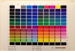 |
Color patches on target for calibrating the printer.
Print on the target printer without Colour Management |
Profiling the printer
This is the last bit of the puzzle. Calibrating the printer. One has to first print a few targets with a bunch of colour patches, (see left), and then measure those same patches on the target print with another tool, a so-called (mouthful) Spectrocolorimeter. This baby actually measures the reflected light bouncing back from each patch. To do that, the Spectrocolorimeter momentarily transmits white light onto each printed patch, which then the latter reflects back to the colorimeter sensor. That's why the target print needs to dry well before you start the procedure. It's also imperative that the same paper quality for which the printer profile is being prepared should be used to print the targets. Also, no colorsync or printer color management should interfere in this print job; this a critical condition of the procedure. The computer simply transmits the target file to the printer, using plain vanilla sRGB. In turn, the calibrating software, being well aware of the average sRGB color value that corresponds to each patch individually, subsequently yields the set of deviations between the expected (standard) values and the measured. All this is reflected in a brand new ICC profile. In all future CM print jobs after calibration, the process should be consistently managed by the ICC profiles for perfect colour managed results.
It's a wrap!
Is a color Management effort worth the cost and time spent in the calibration? I'll rush to respond, I wouldn't be going back to my old habits any time soon. CM is worth every bit of it. It's not just subtle corrections that we are talking about here. For the first time ever, I could experience images in the monitor with colours very close to those I witnessed when I took the picture, and the prints matched my monitor experience more than ever before. I strongly felt that I cracked the CM puzzle. It really seems to be working for me!
_____________________________________________________
** It was funny, during a Ben Long session of his class 'Printing for Photographers' (Lynda.com), where he's been calibrating his brand new monitor, about which he's been bragging all along before calibration, his process reported that it could only cover 80 and change percent of sRGB. He looked flabbergasted with the result and openly took the piss on his calibration gear instead, as he was convinced his monitor was still the best thing money could buy. What a disappointment! When my process showed 100% coverage I had a serious ROFLMAO. I beat you Ben, hands down. Apple still rules!


 In my further ‘quest for the truth’ I was deeply disturbed and intrigued by the ‘signalling processes’ of retina light sensitive cells, the so-called cones and rods. Especially the part that said it were mere proteins, called ‘opsins’ (being firmly fixed in place by 'drilling' thru cone and rod cell membranes with their seven alpha-helix ‘screws’ each), which are responsible for ‘tuning’ a key molecule, a derivative of vitamin-A called ‘retinal’, into absorbing photon energy of predefined wavelengths. Indeed, energy absorption occurs in the form of bell-shaped spectra spanning along large parts of the entire region of visible wavelengths, and it does not happen by any means at only in a few single individual frequencies. There goes the monitor RGB colour reproduction model! There are of course maxima in each spectrum, correspondingly at three ‘special’ wavelengths of 564 (red), 534 (green) and 420 (blue) nanometers, but there’s also energy absorption in each of the spectra along many more frequencies around the peak. In the absence of light, retinals are typically bound to their ‘hosting’ opsins, and wait for photons to ‘pay’ them a visit. 11-Cis-Retinals (that’s how subject matter experts call the specific initial retinal conformations) basically resemble grizzly bears waiting with open-wide gobs to pluck red salmons mid air as the latter jump-swim upstream... Got the picture? When a retinal ‘plucks’ and 'sucks off' energy from an entering photon, one of the molecule’s carbon bindings, the one at the eleventh retinal carbon atom position, breaks up and part of the retinal body twists to bind again in a new spacial position; it isomerizes in other words into the so-called trans-all-Retinal. In that state, it subsequently breaks away from the hosting opsin, which in turn triggers a complex but lightning fast signalling pathway (some chemical events happen in pico secs indeed) in order to send a ‘signal’ to the optical nerve fibers with which the cone/rod cells are synapsed. The pathway of signalling events is kind of reminiscent of a tile layout in a Guinness Book of Records domino tile falling competition. A causes B that in turn forces C to happen and, because of that, D kicks off E... until significant electric potential is built upon the cone/rod cell membrane (a phenomenon known as transduction). This eventually signals the initial trigger from the ‘plucked’ salmon (sorry photon) towards an attached ganglion (a nerve cell) in the optical nerve. Gazillion times a day, for each of the seven and a half billion human inhabitants of planet Earth. Not to mention the remaining living creatures large and small...


